README
rn-country-picker
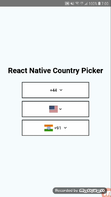
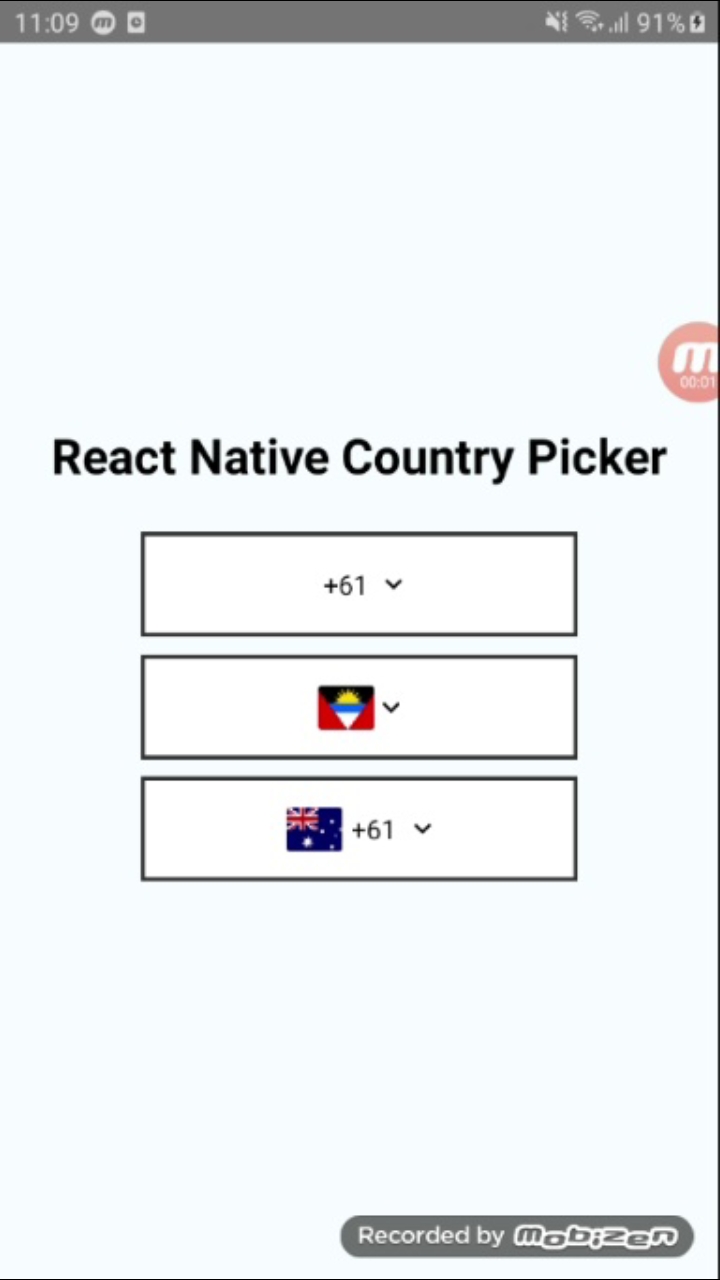
Country picker with Country Code and Flag for react native support both platform IOs and android

Features
- Light weight country picker npm.
- Cross platform compatibility android and ios both.
- Search country using country code or country code.
- Dynamically change dropdown, search and back button images.
- Customizable search bar style and text colors.
- Change animation(Slide, fade, none).
Installation
npm i rn-country-picker
Usage
import {StyleSheet, Text, View} from 'react-native';
import CountryPicker from 'rn-country-picker';
export default class App extends Component {
  constructor(props) {
    super(props);
    this.state = {
      mCountryCode: '91',
    };
  }

  _selectedValue = (index) => {
    this.setState({mCountryCode: index});
  };

  render() {
    return (
      <View style={styles.container}>
        <Text style={styles.titleText}>React Native Country Picker</Text>

        <CountryPicker
          disable={false}
          animationType={'slide'}
          containerStyle={styles.pickerStyle}
          pickerTitleStyle={styles.pickerTitleStyle}
          dropDownImage={require('./res/ic_drop_down.png')}
          selectedCountryTextStyle={styles.selectedCountryTextStyle}
          countryNameTextStyle={styles.countryNameTextStyle}
          pickerTitle={'Country Picker'}
          searchBarPlaceHolder={'Search......'}
          hideCountryFlag={false}
          hideCountryCode={false}
          searchBarStyle={styles.searchBarStyle}
          backButtonImage={require('./res/ic_back_black.png')}
          searchButtonImage={require('./res/ic_search.png')}
          countryCode={this.state.mCountryCode}
          selectedValue={this._selectedValue}
        />
      </View>
    );
  }
}

const styles = StyleSheet.create({
  container: {
    flex: 1,
    justifyContent: 'center',
    alignItems: 'center',
    backgroundColor: '#F5FCFF',
  },
  titleText: {
    color: '#000',
    fontSize: 25,
    marginBottom: 25,
    fontWeight: 'bold',
  },
  pickerTitleStyle: {
    justifyContent: 'center',
    flexDirection: 'row',
    alignSelf: 'center',
    fontWeight: 'bold',
    flex: 1,
    marginLeft: 10,
    fontSize: 16,
    color: '#000',
  },
  pickerStyle: {
    height: 60,
    width: 250,
    marginBottom: 10,
    justifyContent: 'center',
    padding: 10,
    borderWidth: 2,
    borderColor: '#303030',
    backgroundColor: 'white',
  },
  selectedCountryTextStyle: {
    paddingLeft: 5,
    paddingRight: 5,
    color: '#000',
    textAlign: 'right',
  },

  countryNameTextStyle: {
    paddingLeft: 10,
    color: '#000',
    textAlign: 'right',
  },

  searchBarStyle: {
    flex: 1,
    justifyContent: 'center',
    flexDirection: 'row',
    marginLeft: 8,
    marginRight: 10,
  },
});
Properties
| Prop | Default | Type | Description | Required/Optional |
|---|---|---|---|---|
| countryCode | - | string | Default and selected country code | Required |
| pickerTitle | - | string | Change picker title | Required |
| pickerTitleStyle | - | string | Customize picker title style | Required |
| searchBarPlaceHolder | - | string | Change search bar placeholder | Required |
| searchBarStyle | - | object | Customize search bar style | Required |
| containerStyle | - | object | Customize picker style | Required |
| countryNameTextStyle | - | object | Customize country name text style(List View) | Optional |
| selectedCountryTextStyle | - | object | Customize selected label text style | Optional |
| searchButtonImage | - | png/jpg | Add custom search image | Optional |
| backButtonImage | - | png/jpg | Add custom back button image | Optional |
| dropDownImage | - | png/jpg | Add custom drop down image | Optional |
| selectedValue | - | function | callback function received value from list selection | Required |
| animationType | - | string [slide,none,fade] | Change Modal Animation | Optional |
| hideCountryCode | - | bool | hide country code from component only show flag | Optional |
| hideCountryFlag | - | bool | hide country flag from component and List only show code | Optional |
| disable | - | bool | Disable picker if you show default value and no need to change | Optional |