README
semantic-ui-react-form-validator
A semantic-ui implementation of react-form-validator-core

Install
npm install --save semantic-ui-react-form-validator
Index
Input
First Lets look at the simple input field validation. Note: You can use the inline props to get the inline label.
Usage
import React, { Component } from 'react'
import 'semantic-ui-css/semantic.css'; //Import the css only once in your project
import {Form,Input} from 'semantic-ui-react-form-validator'
import {Button} from 'semantic-ui-react';
class App extends Component {
  render () {
    return (
      <Form
      ref="form"
      onSubmit={this.onSubmit}
      >
        <Input
          type="text"
          label="Test Input"
          onChange={(e)=>{this.setState({value:e.target.value})}}
          value={this.state.value}
          validators={['required']}
          errorMessages={['this field is required']}
          width={6}
          />

        <Button color="teal">Submit<Button>
      </From>
    )
  }
}
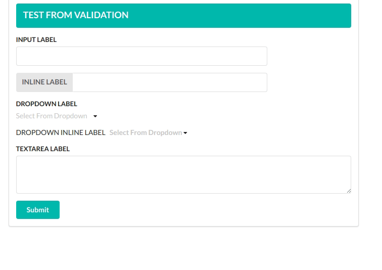
Result
Here is a list of all props you can use in the Input Component.
| Props | Required | Type | Default value | Description |
|---|---|---|---|---|
| type | true | string |
text | Basic html input type |
| placeholder | false | string |
Basic html placeholder | |
| label | false | string |
label | |
| inline | false | bool |
Set it true to get inline labels | |
| validators | false | array |
Array of validators. See list of default validators above.Leave empty for no validations | |
| errorMessages | false | array |
Array of error messages. Order of messages should be the same as validators prop. | |
| onChange | true | func |
onChange function is required to set the value of the input filed | |
| value | true | string |
empty String | You need to set the value of the input field in onChange function and pass the value as a prop to the Input Component.The validator looks for this value. |
| width | false | int |
12 | width of the input field. 12 means it will match the parent width |
| ## Dropdown | ||||
| Dropdown Component is pretty similar to the Input Component. | ||||
| ### Usage | ||||
| ```jsx | ||||
| import React, { Component } from 'react' | ||||
| import 'semantic-ui-css/semantic.css'; //Import the css only once in your project | ||||
| import {Form,Dropdown} from 'semantic-ui-react-form-validator' | ||||
| import {Button} from 'semantic-ui-react'; | ||||
| class App extends Component { | ||||
| render () { | ||||
| const options=[ | ||||
| { | ||||
| key: 'Jenny Hess', | ||||
| text: 'Jenny Hess', | ||||
| value: 'Jenny Hess', | ||||
| image: { avatar: true, src: '/images/avatar/small/jenny.jpg' }, | ||||
| }, | ||||
| { | ||||
| key: 'Elliot Fu', | ||||
| text: 'Elliot Fu', | ||||
| value: 'Elliot Fu', | ||||
| image: { avatar: true, src: '/images/avatar/small/elliot.jpg' }, | ||||
| }, | ||||
| { | ||||
| key: 'Stevie Feliciano', | ||||
| text: 'Stevie Feliciano', | ||||
| value: 'Stevie Feliciano', | ||||
| image: { avatar: true, src: '/images/avatar/small/stevie.jpg' }, | ||||
| }, | ||||
| { | ||||
| key: 'Christian', | ||||
| text: 'Christian', | ||||
| value: 'Christian', | ||||
| image: { avatar: true, src: '/images/avatar/small/christian.jpg' }, | ||||
| }, | ||||
| { | ||||
| key: 'Matt', | ||||
| text: 'Matt', | ||||
| value: 'Matt', | ||||
| image: { avatar: true, src: '/images/avatar/small/matt.jpg' }, | ||||
| }, | ||||
| { | ||||
| key: 'Justen Kitsune', | ||||
| text: 'Justen Kitsune', | ||||
| value: 'Justen Kitsune', | ||||
| image: { avatar: true, src: '/images/avatar/small/justen.jpg' }, | ||||
| }, | ||||
| ]; | ||||
| return ( | ||||
| <Form | ||||
| ref="form" | ||||
| onSubmit={this.onSubmit} | ||||
| > | ||||
| <Dropdown | ||||
| label="Test Dropdown" | ||||
| onChange={(e,{value})=>{this.setState({dropdown:value})}} | ||||
| value={this.state.dropdown} | ||||
| validators={['required']} | ||||
| errorMessages={['this field is required']} | ||||
| validators={['required']} | ||||
| errorMessages={['You must select one option']} | ||||
| options={options} | ||||
| /> |
    <Button color="teal">Submit<Button>
  </From>
)
} }
## Result

##### Here is a list of all props you can use in the *Dropdown* Component.
| Props | Required | Type | Default value | Description |
| ---- | -------- | ---- | ------------- | ----------- |
| placeholder | false | ```string``` | | Basic html placeholder |
| label | false | ```string``` | | label |
| inline | false | ```bool``` | | Set it true to get inline labels |
| validators | false | ```array``` | | Array of validators. See list of default validators above.Leave empty for no validations |
| errorMessages | false | ```array``` | | Array of error messages. Order of messages should be the same as validators prop. |
| onChange | true | ```func``` | | *onChange* function is required to set the value of the input filed ``` onChange=(e,{value})=>{ //handle value} ``` |
| value | true | ```string``` | | You need to set the value of the input field in *onChange* function and pass the value as a prop to the *Input* Component.The validator looks for this value. |
| options | true | ```array``` | | A list of options as an array. eg:- ``` [{key:1,text:"foo",value:1},{key:2,text:"bar",value:2}] ```
| multiple | false | ```bool``` | | Set it ```true``` to select more than one options |
| selection | false |``` bool``` | | Set it ```true``` to make the dropdown look like select field |
| search | false |``` bool``` | | You'll be able to search from dropdown options when set to ```true```|
| width | false | ```int``` | 12 | width of the input field. 12 means it will match the parent width |
## TextArea
### Usage
```jsx
import React, { Component } from 'react'
import 'semantic-ui-css/semantic.css'; //Import the css only once in your project
import {Form,TextArea} from 'semantic-ui-react-form-validator'
import {Button} from 'semantic-ui-react';
class App extends Component {
render () {
return (
<Form
ref="form"
onSubmit={this.onSubmit}
>
<TextArea
label="TEXTAREA LABEL"
validators={['required']}
errorMessages={['CAnnot Be empty']}
value={this.state.txtValue}
onChange={e=>{this.setState({txtValue:e.target.value})}}
/>
<Button color="teal">Submit<Button>
</From>
)
}
}
Here is a list of all props you can use in the Dropdown Component.
| Props | Required | Type | Default value | Description |
|---|---|---|---|---|
| placeholder | false | string |
Basic html placeholder | |
| label | false | string |
label | |
| validators | false | array |
Array of validators. See list of default validators above.Leave empty for no validations | |
| errorMessages | false | array |
Array of error messages. Order of messages should be the same as validators prop. | |
| onChange | true | func |
onChange function is required to set the value of the input filed | |
| value | true | string |
empty String | You need to set the value of the input field in onChange function and pass the value as a prop to the Input Component.The validator looks for this value. |
Validation Rules
Simple form validation component for react forms inspired by formsy-react
Default validation rules:
- matchRegexp
- isEmail
- isEmpty
- required
- trim
- isNumber
- isFloat
- isPositive
- minNumber
- maxNumber
- minFloat
- maxFloat
- minStringLength
- maxStringLength
- isString
- maxFileSize
- allowedExtensions
Some rules can accept extra parameter, example:
<Input
   {...someProps}
   validators={['minNumber:0', 'maxNumber:255', 'matchRegexp:^[0-9]