README


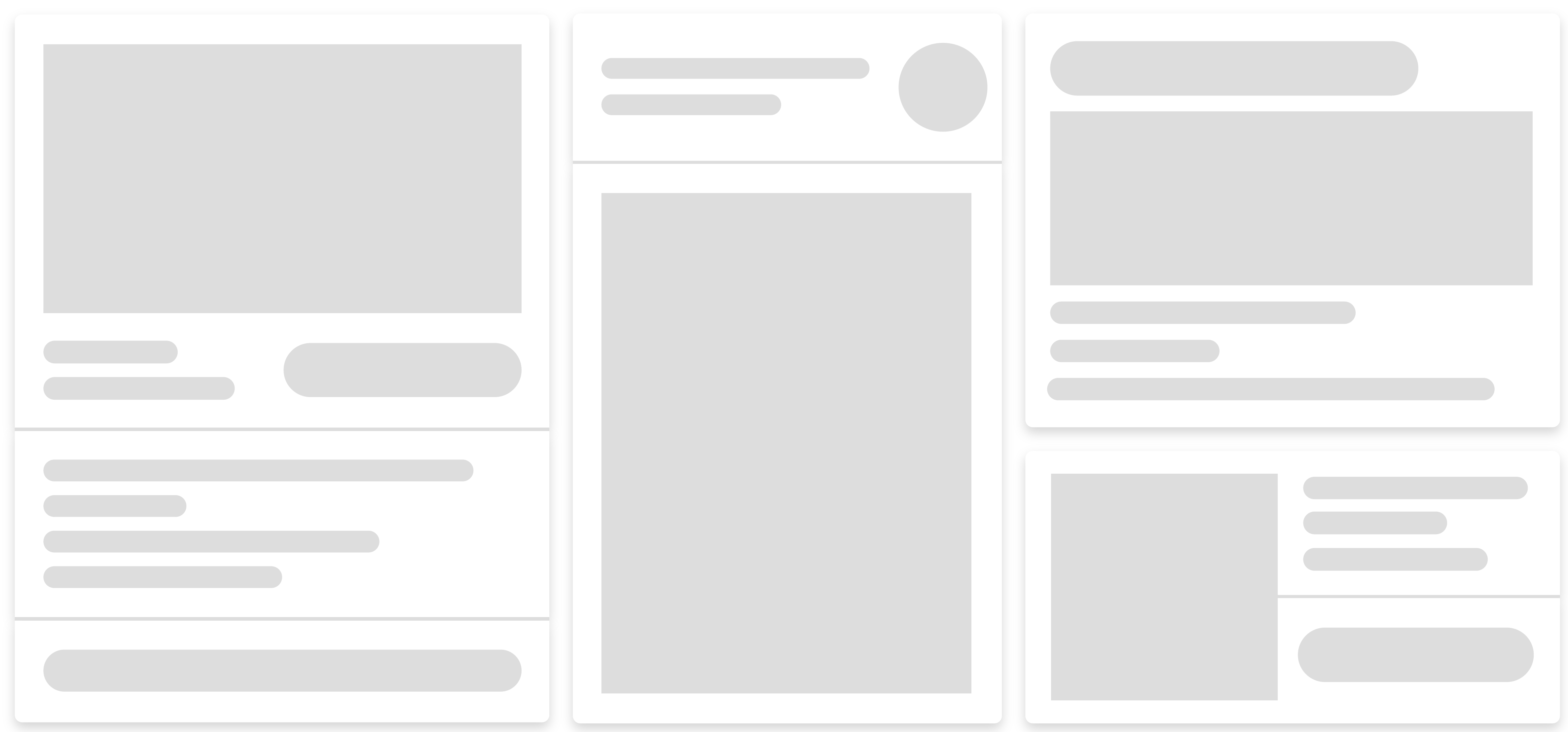
SKELETON SCREEN CSS
A minimalistic complete set of elements for a skeleton screen consisting of pure css. Includes scss source, minified and non-minified compiled css files with browser vendor prefixes.
What is it for:
A skeleton screen is essentially a blank version of a page or block into which information is gradually loaded. At the time of loading, the content is replaced by a placeholder that repeats its outline and shows the user that it is loading. After successful loading, the placeholder is instantly replaced with content, creating a feeling of fast speed and responsiveness of the page.
Install:
with npm
npm i skeleton-screen-css --save
or you can download the archive with the project and manually transfer the necessary files to your project folder.
Included files:
- index.scss - source code with default variables;
- index.css - non-minified compiled css with browsers vendor prefixes;
- index.min.css - minified compiled css with browsers vendor prefixes (default with importing via modules);
Using:
Default - compiled minified css
In browser:
<link rel="stylesheet" href="index.min.css" />
Webpack, rollup, parcel or any other bundler:
import "skeleton-screen-css";
/* or */
require("skeleton-screen-css");
import with css/scss
/* May required path to file or alias if bundler used.
See the documentation for the bundler */
@import "skeleton-screen-css";
Source file
/* Overriding default variables */
$skeleton-element-color: #cecece;
/* $other-variable-name: value; */

/* Import scss source file */
@import "skeleton-screen-css/dist/index.scss";
Variables
$skeleton-element-color: rgba(0, 0, 0, 0.17) !default;

$skeleton-loading-animation-time: 1.3s !default;

$skeleton-margin-standart: 16px !default;
$skeleton-margin-small: $skeleton-margin-standart / 2 !default;

$skeleton-card-box-shadow: 0 2px 4px 1px rgba(0, 0, 0, 0.17) !default;
$skeleton-card-background-color: #ffffff !default;
$skeleton-card-border-radius: 5px !default;

$skeleton-circle-size: 50px !default;

$skeleton-hr-height: 2px !default;

$skeleton-line-border-radius: 15px !default;
$skeleton-line-height: 12px !default;
$skeleton-line-margin-bottom: 8px !default;

$skeleton-headline-height: $skeleton-line-height * 2 !default;

$skeleton-square-height: 150px !default;
Basic elements
<!-- Elements classes -->
<div class="ssc-circle"></div>

<div class="ssc-head-line"></div>

<div class="ssc-line"></div>

<div class="ssc-square"></div>

<div class="ssc-hr"></div>

<!-- Card class -->
<div class="ssc-card"></div>

<!-- Wrapper class for padding -->
<div class="ssc-wrapper">Card with content</div>

<!-- Main parent class -->
<div class="ssc"></div>
Helpers classes
/** Helpers classes work inside 'ssc' class */
.ssc {
    .mb {
        margin-bottom: $skeleton-margin-standart;
    }

    .mt {
        margin-top: $skeleton-margin-standart;
    }

    .mr {
        margin-right: $skeleton-margin-standart;
    }

    .ml {
        margin-left: $skeleton-margin-standart;
    }

    .mbs {
        margin-bottom: $skeleton-margin-small;
    }

    .mts {
        margin-top: $skeleton-margin-small;
    }

    .mrs {
        margin-right: $skeleton-margin-small;
    }

    .mls {
        margin-left: $skeleton-margin-small;
    }

    .w-10 {
        width: 10%;
    }

    .w-20 {
        width: 20%;
    }

    .w-30 {
        width: 30%;
    }

    .w-40 {
        width: 40%;
    }

    .w-50 {
        width: 50%;
    }

    .w-60 {
        width: 60%;
    }

    .w-70 {
        width: 70%;
    }

    .w-80 {
        width: 80%;
    }

    .w-90 {
        width: 90%;
    }

    .w-100 {
        width: 100%;
    }

    .flex {
        display: flex;
    }

    .inline-flex {
        display: inline-flex;
    }

    .align-center {
        align-items: center;
    }

    .align-start {
        align-items: flex-start;
    }

    .align-end {
        align-items: flex-end;
    }

    .align-stretch {
        align-items: stretch;
    }

    .justify-start {
        justify-content: start;
    }

    .justify-end {
        justify-content: end;
    }
    .justify-between {
        justify-content: space-between;
    }

    .justify-center {
        justify-content: center;
    }

    .justify-around {
        justify-content: space-around;
    }
}
Example - card
<div class="ssc ssc-card" style="max-width: 300px">
    <div class="ssc-wrapper">
        <div class="ssc-square mb"></div>
        <div class="flex align-center justify-between">
            <div class="w-40">
                <div class="ssc-line w-70"></div>
                <div class="ssc-line w-100"></div>
            </div>
            <div class="ssc-head-line w-50"></div>
        </div>
    </div>
    <div class="ssc-hr"></div>
    <div class="ssc-wrapper">
        <div class="ssc-line w-90"></div>
        <div class="ssc-line w-30"></div>
        <div class="ssc-line w-70"></div>
        <div class="ssc-line w-50"></div>
    </div>
    <div class="ssc-hr"></div>
    <div class="ssc-wrapper">
        <div class="ssc-head-line"></div>
    </div>
</div>