README
slider-carousel | Angular 10
Angular component of the carousel, using the slider as a transition. This is a simple, clean and light alternative. It also does not need dependencies.
Compatible with previous versions of Angular, except AngularJS.
Use example (more examples).
<slider-carousel [images]="example.images"></slider-carousel>

Usage
Install
npm install slider-carousel
Import into Module
import { SliderCarouselModule } from 'slider-carousel';

@NgModule({
  imports: [
    ...,
    SliderCarouselModule
  ],
  declarations: [...],
  providers: [],
  bootstrap: [AppComponent]
})
export class AppModule { }
Import into style.scss file application.
@import '~slider-carousel/slider-carousel.scss';
@include slider-carousel();
Or import with colors (default color and background color)
@import '~slider-carousel/slider-carousel.scss';
@include slider-carousel($defaultColor, $bgColor);
API
Inputs/Outputs (Required)
| Name | Type | Description |
|---|---|---|
images |
string[] or { lg: string, md?: string, sm?: string }[] |
Address list of the images to be displayed. He accept an array of object (with the sizes of each images) or a simple array of string. |
Inputs/Outputs (Optional)
| Name | Type | Default | Description |
|---|---|---|---|
preview |
boolean |
true |
To open full image. (ex .: <... [preview]="true"></...>). |
auto-size |
string |
'100%' |
Images are displayed each with their respective but responsive measurements. (ex .: <... [auto-size]="true"></...>). |
height |
string |
'500px' |
Define a fixed height to container. (ex .: <... height="350px"></...>). |
width |
string |
'100%' |
Define a fixed width to container. (ex .: <... width="300px"></...>). |
max-width |
string |
'100%' |
Define a max width to container. (ex .: <... max-width="800px"></...>). |
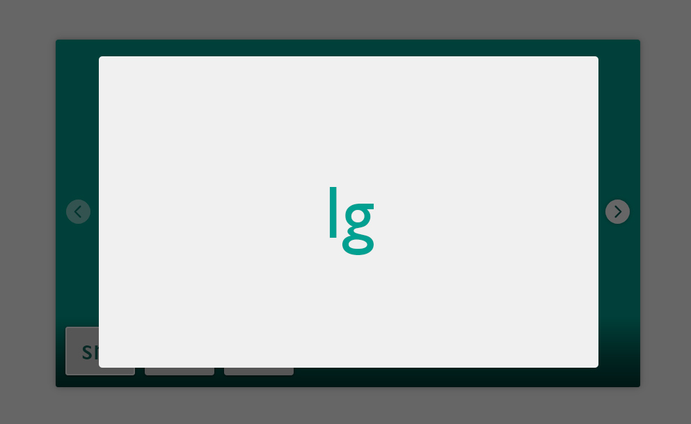
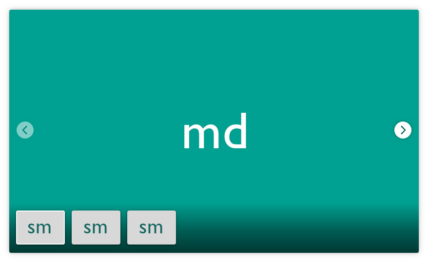
Understand images sizes
The sm is thumbnail and md is carousel image:
The lg is full image on preview mode: