README
storybook-color-picker
Description
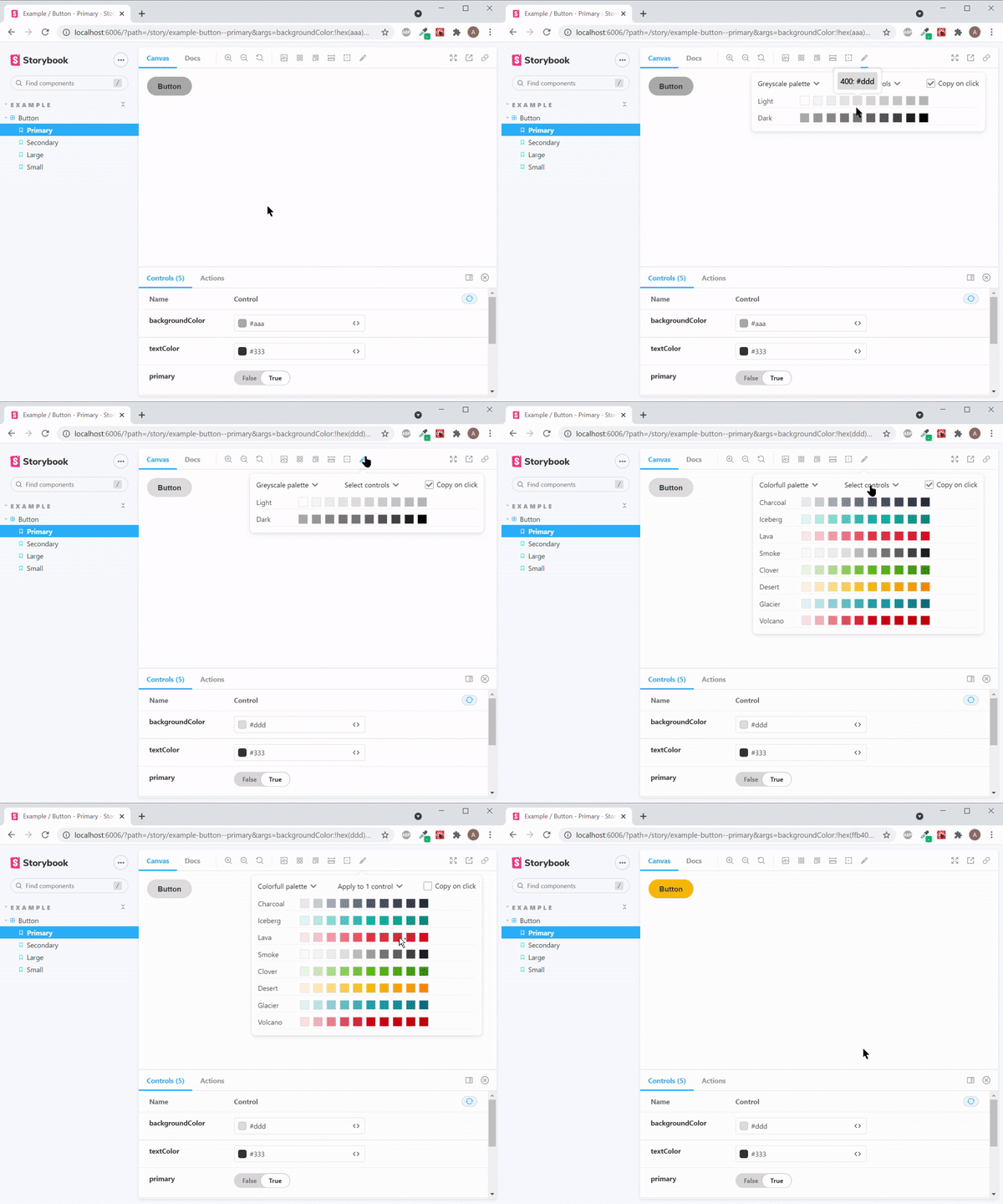
A Storybook addon. It allows you to quickly find any color from your custom color palette and set it on component's controls and/or copy to clipboard.
Add one or multiple color palettes and set the primary palette globaly, for component or single story.

Technology
Created with TypeScript, React and Storybook.
Migrate from v1 to v2
To migrate from v1 to v2 adjust parameters in preview.js to match the pattern shown in Add palettes in usage section below.
Usage
$ npm i storybook-color-picker
Add to your Storybook
In your .storybook folder find main.js file and add this addon like below.
  module.exports = {
    ...
    "addons": [
      ...
      "storybook-color-picker"
    ]
  };
Add palettes
Globaly
This will add color picker and palettes everywhere in your storybook.
In your .storybook folder find preview.js file and add your color palette to parameters like below.
Scroll down to find out how your color palette must look like.
import yourFirstColorPalette from './yourFirstColorPalette.json';
import yourSecondColorPalette from './yourSecondColorPalette.json';

export const parameters = {
  ...
  colorPicker: {
    primaryPalette: 'Your first palette name', // Name of primary palette for all components and its stories. Optional (fallback to first palette from the palettes array).
    palettes: [
      {
        name: 'Your first palette name', // string
        palette: yourFirstColorPalette, // Palette as an Object or an Array. See bellow.
      },
      {
        name: 'Your second palette name',
        palette: yourSecondColorPalette,
      },
    ]
  }
};
On component
This will add color picker and palettes to all component's stories.
In MyComponent.stories.js add:
export default {
  ...
  parameters: {
    ...
    colorPicker: {
      primaryPalette: 'Your first palette name',
      palettes: [
        {
          name: 'Your first palette name',
          palette: yourFirstColorPalette,
        },
        {
          name: 'Your second palette name',
          palette: yourSecondColorPalette,
        },
      ]
    }
  }
};
On story
This will add color picker and palettes to specific story.
In MyComponent.stories.js add:
export const Primary = Template.bind({});

Primary.parameters = {
  ...
    colorPicker: {
      palettes: [
        {
          name: 'Your first palette name',
          palette: yourFirstColorPalette,
        },
      ]
    }
}
Deprecation Info
Before v2.3.0 colorPicker parameter was called colorPalettes.
Before v2.3.0 primaryPalette parameter was called default.
Both are still supported but will be removed in next major release.
Palette
as Object
type ColorPaletteAsObject = Record<string, Record<string, string> | string>;
Example:
  {
    "white": "#fff", // valid hex, rgb, rgba, hsl, hsla
    "black": "#000",
    "light": {
      " 500": "#aaa",
      " 100": "rgba(238, 238, 238, .8)",
      " 200": "rgb(238, 238, 238)",
      " 300": "hsla(0, 0%, 73%, .8)",
      " 400": "hsl(0, 0%, 73%)"
    },
    "dark": {
      "0100": "#888",
      "0500": "#000",
      "0400": "#222",
      "0200": "#666",
      "0300": "#444"
    }
  }
Usefull tip: add white spaces or zeros before numerical keys to prevent auto sorting
as Array
  type ColorPaletteAsArray = {
    label: string,
    values: [
      {
        label: string,
        value: string,
      }
    ],
  };
Example:
  [
    {
      "label": "light",
      "values": [
        {
          "label": "100",
          "value": "#fff"
        },
        {
          "label": "200",
          "value": "#aaa"
        }
      ]
    },
    {
      "label": "dark",
      "values": [
        {
          "label": "100",
          "value": "#222"
        },
        {
          "label": "200",
          "value": "#000000"
        }
      ]
    }
  ]
Set primary palette on component or its stories
On component
This will apply for all component's stories.
In MyComponent.stories.js add:
export default {
  ...
  parameters: {
    colorPicker: {
      primaryPalette: 'Your second palette name',
    }
  }
};
On story
This will apply for specific story.
In MyComponent.stories.js add:
export const Primary = Template.bind({});

Primary.parameters = {
  ...
  colorPicker: {
    primaryPalette: 'Your first palette name',
  }
}
primaryPalette specificity:
The following list increases by specificity.
primaryPaletteset on parameters inpreview.jsprimaryPaletteset on componentparametersprimaryPaletteset on storyMyComponent.parameters
Deprecation Info
Before v2.3.0 colorPicker parameter was called colorPalettes.
Before v2.3.0 primaryPalette parameter was called defaultColorPalette.
It is still supported but will be removed in next major release.
Apply selected color to component's control
All controls with type of "color" will be detected automatically. You can add extra controls to whitch color may be applied. Only controls of type "text" may be added as extra.
On component
Add list of extra controls to all component's stories.
In MyComponent.stories.js add:
export default {
  ...
  argTypes: {
    backgroundColor: { control: 'color' }, // Color controls will be detected automatically
    label: { control: 'text' }, // Text controls may be added as extra
    text: { control: 'text' }, // Text controls may be added as extra
  },
  parameters: {
    ...
    colorPicker: {
      applyColorTo: ['label'] // Must match argType key
    }
  }
};
On story
Add list of extra controls to selected story to overwrite list added to component globaly as in example above.
In MyComponent.stories.js add:
export const Primary = Template.bind({});

Primary.parameters = {
  ...
  colorPicker: {
    applyColorTo: ['text'], // Pass empty array to clear extra controls
  }
};
Before v2.3.0 colorPicker parameter was called colorPalettes.
It is still supported but will be removed in next major release.
Default palettes
Added in v2.3.0
Disable default palettes
To disable default palettes just add disableDefaultPalettes: true to global, component or story parameters.