README
svelte-repo-card
A simple GitHub repo card component based on Tarptaeya/repo-card.
Installation
npm i -D svelte-repo-card
Usage
<script>
  import RepoCard from "svelte-repo-card";
</script>

<RepoCard slug="<user>/<repo>" />
It's that simple!
Theming
If you want to control the appearance of the card you have three options:
- Pass
"light"or"dark"to thethemeattribute to use the built-in light and dark themes.
<RepoCard slug="<user>/<repo>" theme="light" />
<RepoCard slug="<user>/<repo>" theme="dark" />
- Pass a full custom object.
<script lang="ts">
  // {...}

  import type { Theme } from "svelte-repo-card";
  const theme: Theme = {
    // The color of the text.
    text: "#586069",

    // The color of the links.
    link: "#0366d6",

    // The background color.
    background: "#ffffff",

    // The border color.
    border: "#e1e4e8",
  };
</script>

<RepoCard slug="<user>/<repo>" {theme} />
- Use the
--svc-*css variables:
:root {
  --svc-text-primary: #586069;
  --svc-text-link: #0366d6;
  --svc-background: #ffffff;
  --svc-border-color: #e1e4e8;
}
Examples
<RepoCard slug="thislooksfun/svelte-repo-card" />: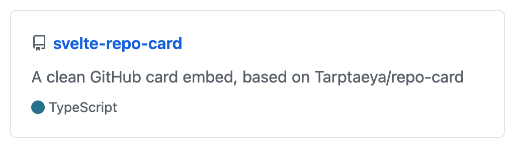
<RepoCard slug="thislooksfun/SwiftlySearch" />:
- For a live demo you can check out my website.