README
vc-popup(stable)
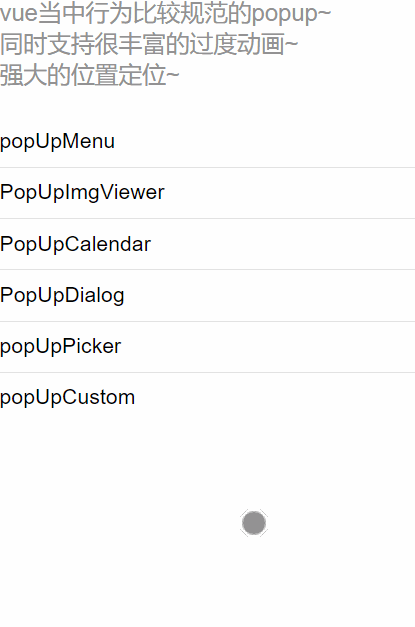
一个行为标准的vue-popup组件集

特点
- 支持
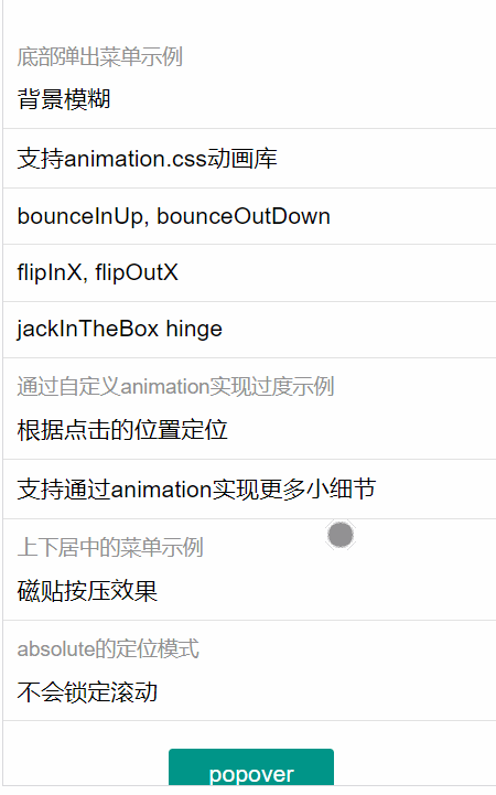
返回键, 可以按浏览器返回按钮关闭popup- 支持popup的层叠显示
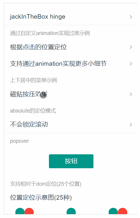
- 可以写出小复杂的
过渡动画, 比如磁贴按压效果[在popupMenu可看到~]- 支持css动画库, 比如animation.css, 使用的时候自行添加依赖就好了
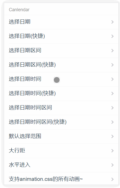
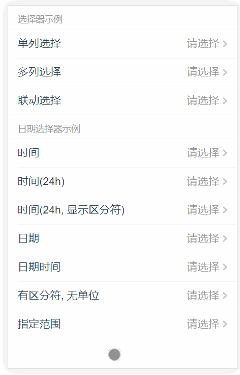
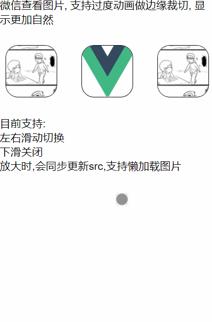
- 提供了几个比较好的popup组件, calendar, picker, imgViewer
行为定义相对标准, 这一点比较重要的, 前端行为定义犹如算法的输入定义一样, 比如触发关闭之后, 结束动画未结束之前, popup会拦截输入事件, popup属于不可交互状态- 可方便进行拓展~
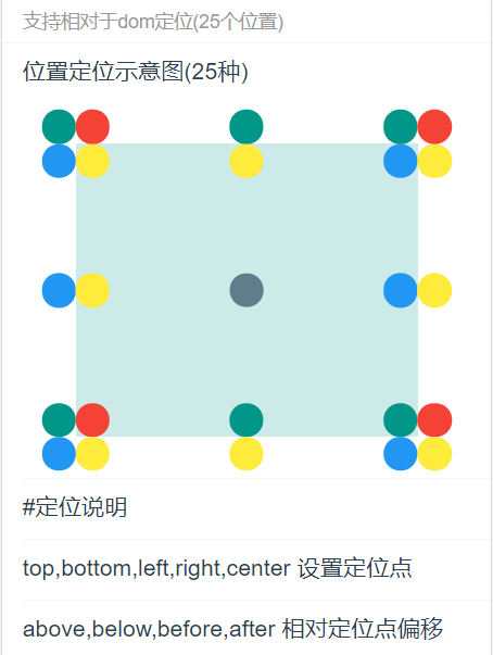
- 差点忘说了, 强大的定位支持, 有
居中,clickRelative,domRelative, 其中domRelative支持25个位置Layer都经过优化了, 层次合理, 压缩层比较少, 没有层爆炸的情况- 采用的是
绝对的置顶策略, 就是即便在页面内设置fixed+z-index:99999999999;, 都不会遮盖弹出的popup~
注:因为这是之前给一个组件库贡献的, 现在把popup系列提取出来,部分组件从那个组件库中拿来, 比如example用到的cell,group,buttom,(现在已经移除依赖), 其中picker-view是我优化过的, 其余都是自己写哒
预览Demo
使用
注: 需要配合webpack来使用
yarn add vc-popup
在入口main.js导入依赖, 除此之外,现在可以单独组件使用了~
...
import Vue from 'vue'
import PopUp from 'vc-popup'
import 'vc-popup/lib/style.css'

Vue.use(PopUp)

// 通过这样来部分引入
import Picker from 'vc-popup/packages/popup-picker'

// 或者yarn add vc-popup-[子包名]之后
import Picker from 'vc-popup-picker'

Vue.use(Picker)
...
在index.html结构需要如下: (id无关)
...
<body>
  <div id="app"></div>
  <!--将会插入下面节点-->
  <div data-v-xxxxxxxx="" class="vc-popup-conatiner"></div>
</body>
...
会添加如下样式, 请确保用于挂载的节点如下样式生效
body > *:first-child{
  position: relative;
  z-index: 0;
}
在页面中使用
<template>
  <div class="page">
    <div class="btn" @click="click">show popup</div>
  </div>
</template>

<script>
  export default {
    mounted () {
      // 通过console.log(this.$popup) 可以知道当前注册了那些popup
      this.Popover = new this.$popup.Popover({
        ...config
        propsData: {}
      })
    },
    methods: {
      click (e){
        this.Popover.open(e, {
          ...config
          propsData: {}
        });

        this.Popover.close()
      }
    }
  }
</script>
基本参数
{
  // 在hash当中的名字, 如果为undefined的话,那么将会采用`popupName_levelNum`
  // 自定义的时候, 则需要人工保证唯一, 不然返回就检查不出来
  // 一般不需要设置
  name: {
    options: String | undefined
    default: undefined
  },

  // vue组件的参数
  propsData: Object,

  // 父级滚动互斥
  lockScroll,

  // 设置定位方式
  positionType,
  position,

  // clickRelative的相关
  frame,
  margin,

  // domRelative的相关
  refDom,
  refCorner,
  relativeToCorner,

  // 动画设置
  animation,
  autoSetOrthocenter,
  animationConfigurable,

  // 样式覆盖内置
  className,
  maskOpacity,
  maskBgColor,

  // 事件钩子
  beforeEnter,
  afterEnter,
  beforeLeave,
  afterLeave
}
详细参数
{
  // 定位的类型, 是否锁定滚动
  positionType: {
    options: 'absolute' | 'fixed',
    default: 'absolute'
  },

  // 父级滚动互斥
  lockScroll: {
    options: true | false,
    default: true
  },

  // 设置定位方式, 在popup的vue的style也可以定位, 不会与之冲突, 最终结果是二者的叠加
  position: {
    options: 'clickRelative' | 'domRelative' | 'center' | positionConfig,
    default: 'center',

    // 相对于视窗的各边的距离, 支持负数,百分比
    // 如果top, bottom同时为undefined, 设置为居中
    positionConfig: {
      top:    Number | undefined,
      bottom: Number | undefined,
      left:   Number | undefined,
      right:  Number | undefined
    }

    // example
    position: 'clickRelative',
    position: 'domRelative',
  },

  //// clickRelative的相关 \\\\

  // 弹出的popup在此区域之内
  frame: {
    options: HTMLElement | undefined | frameConfig,
    default: undefined,

    frameConfig: {
      top:    Number,
      buttom: Number,
      left:   Number,
      right:  Number
    }

    // example
    frame: document.querySelector('#box'),
    frame: {
      top:    10,
      buttom: 0,
      left:   0,
      right:  10
    },
  },

  // 弹出的popup距离区域边框的边距
  // 支持百分比, 百分比相对于区域对应轴
  // 比如margin: 10%, 结果是, 左/右: 10%区域宽, 上/下: 10%区域高
  margin: {
    options: marginUnit | Array<marginUnit>{2} | Array<marginUnit>{4},
    default: undefined,

    marginUnit: Number | String,

    // example
    margin: 10,    // 设置4个边一样 10px
    margin: '10%', // 设置4个边一样 10%, css的长度单位即可
    margin: [10%, '10px'],               // 分别设置x,y轴
    margin: [10%, '10px', 10%, '10px'],  // 分别设置4边, 顺序上右下左, 和css的margin一样
  },

  //// domRelative的相关 \\\\

  // 设置参考Dom节点
  refDom: HTMLElement,
  // 设置参考点, 参考dom节点的方位
  refCorner: "top/bottom/center left/right/center",
  // 设置相对于参考点的方位
  relativeToCorner: "above/below before/after",


  //// 动画设置 \\\\

  // 根据position的位置设置transform-origin
  autoSetOrthocenter: {
    options: Boolean,
    default: false
  },

  // 设置动画的进出动画, 会和popup的vue里面通过提供的事件钩子实现的过渡动画冲突
  // 想定制通用过渡动画可参考effect的编写
  // 不过并非所有都支持animation, 一些使用定制过渡动画, 会设置animationConfigurable为false
  // 注意: 自定义class需要有css3的过渡动画, 不然animationend/transitionend就不会触发~
  animation: {
    options: classConfig | effectConfig | switchConfig | transitionCfg,
    default: undefined,

    switchConfig: {
      in:  Boolean,
      out: Boolean
    },
    classConfig: {
      in:  Array<String | Object> | String,
      out: Array<String | Object> | String
    },
    effectConfig: {
      in:  {effect: String},
      out: {effect: String}
    },
    transitionCfg: {
      init: Array<String | Object> | String,
      in:   Array<String | Object> | String,
      out:  Array<String | Object> | String
    }
    /* transitionCfg的init需要这样来提高一下权重
    .in.init {}
    .in {}
    .out {}
    */

    // example
    animation: {
      in:  false, // 禁用进入过渡动画(包括mask)
      out: false, // 禁用离开过渡动画(包括mask)
    }
    animation: {
      in:  ["animated", "flipInX"],   // 需要引入animation.css库
      out: ["animated", "flipOutX"],
    }
    animation: {
      in: {
        effect: "zoomFromDom",         // 内置已提供
        fromDom: HTMLElement | evt.target
      },
      out: {
        effect: "zoomFromDom",
        fromDom: HTMLElement | evt.target
      }
    }
    animation: {
      in:  'vc-effect-turbulence-in',   // 内置已提供
      out: 'vc-effect-turbulence-out',
    }
    animation: {
      init: 'vc-slide-up-init',        // 内置已提供
      in:   'vc-slide-up-in',
      out:  'vc-slide-up-out',
    },
    // 混合
    animation: {
      in:  [
        'vc-effect-turbulence-in',
        {
          effect: 'bodyBlur'
        }
      ],
      out: 'vc-effect-turbulence-out',
    }
  },

  // 是否支持animation的配置来修改过渡动画, 在一些定制的过渡动画可以设置为true来避免冲突
  animationConfigurable: {
    options: Boolean,
    default: true
  },

  // 样式覆盖内置
  className: {
    options: Array<String> | String,
    default: undefined

    //example
    className: 'custom-skin',
    className: ['custom-skin-base', 'custom-skin-baner']
  },

  // mask的透明度
  maskOpacity: {
    options: Number,
    default: 0.25,
  },

  // mask的颜色
  maskBgColor: {
    options: String,
    default: 'black'
  }
}
propsData定义
具体popup的使用可以查看/packages/[popup-name]/readme.md
popup-over's readme
popup-dialog's readme
popup-picker's readme
popup-calendar's readme
popup-img-viewer's readme
popup-press-menu's readme
popup-bottom-menu's readme
popup-center-menu's readme
popup-datetime-picker's readme
popup-effect-tile-press's readme
已知问题
如果项目需要支持IOS7/8, 在使用picker的时候, 需要添加Object.values的polyfill 可以参考http://babeljs.io/docs/usage/polyfill/ 或者MDN's Object.values
拓展
License
MIT 一起来扣细节~