README
Verifalia widget - Add real-time email verification to your page, with no coding required
Verifalia provides a powerful and super-fast service to validate email addresses in real-time and check whether they are deliverable or not; once included in a web page, this Javascript widget automatically binds to every input field of type email (or those with the email word in their names or IDs) it finds and prevents its containing form to be submitted, unless the field contains a valid email address pointing to an active and real mailbox. The widget comes as a lightweight (9KB gzipped) single Javascript file, with zero dependencies!
By default, the widget automatically blocks both invalid / unreachable email addresses as well as disposable and throw-away addresses but you can configure it very easily to exclude other ones (for example, those provided by free email service providers like Gmail or Yahoo).
While this widget is suitable for many integration scenarios, it only runs in the browser and its features are limited: check out the Verifalia SDK library for Javascript for a much more advanced solution with support for Node.js (in addition to the browser!), as well as a vastly extended set of features.
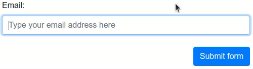
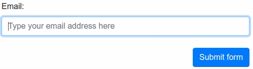
The Verifalia widget provides out-of-the-box, automatic support for all HTML5 forms (including mobile ones): just drop it into any web page and every email address entered through any of its field will be automatically validated in real-time. See below for advanced options.
It also integrates automatically with the following validation libraries and form building services, if they are detected upon loading: FormSite, FormStack, FormValidation, jQuery Validation Plugin, Parsley, Validate.js.
Installing the widget on your page
First things first: using the Verifalia email verification service requires to have a Verifalia account: if you don't have one, just register for a free one. In addition to that, this widget requires a browser app key (a sequence of alphanumeric characters): create a browser app, if you don't have one already. Once on the Verifalia dashboard, you can just exploit its code generation feature and copy the code snippet you can find on the Embeddable widget tab - it will include the HTML code needed to embed the Verifalia widget along with your browser app key. Just paste it on your page or form and you will be all set!
Manual installation
As an alternative to the code generation feature offered by the Verifalia dashboard, you can manually copy the following HTML block before the closing </body> tag and point the script source to the verifalia-widget.js file, which can be grabbed from one of the CDNs which serve projects hosted on npm. Just remember you need to set the data-verifalia-appkey attribute according to your browser app key, which you can grab in the Verifalia dashboard; as an alternative to the aforementioned attribute, you can also set your browser app key using JavaScript, as explained in the next section.
    ...

    <script defer
            src="https://unpkg.com/verifalia-widget@1.7.0/dist/verifalia-widget.js"
            data-verifalia-appkey="YOUR BROWSER APP KEY HERE"
            integrity="sha512-46/CxCzEBeSTtPFzK3OpgNK0FF8LiWQP/GZWblt/BP3q6oSFpvp3B1FLcJ+a23Rb7n5idiYmvTDsZQABPZcLmA=="
            crossorigin="anonymous"></script>
    <div style="display: none">Powered by Verifalia <a href="https://verifalia.com/">email verification</a></div>

</body>
</html>
or
    ...

    <script defer
            src="https://cdn.jsdelivr.net/npm/verifalia-widget@1.7.0/dist/verifalia-widget.js"
            data-verifalia-appkey="YOUR BROWSER APP KEY HERE"
            integrity="sha512-46/CxCzEBeSTtPFzK3OpgNK0FF8LiWQP/GZWblt/BP3q6oSFpvp3B1FLcJ+a23Rb7n5idiYmvTDsZQABPZcLmA=="
            crossorigin="anonymous"></script>
    <div style="display: none">Powered by Verifalia <a href="https://verifalia.com/">email verification</a></div>

</body>
</html>
CDNs courtesy of unpkg and jsDelivr.
Alternatively, you can host the Javascript file yourself: to do that, use npm to automatically download and install the required files. With npm installed, run the following from your project root:
$ npm install verifalia-widget
Once done, the verifalia-widget.js file will be available on the ./node_modules/verifalia-widget/dist/verifalia-widget.js folder.
How it works
While it does not have any dependency at all, the widget offers out-of-the-box support for standard HTML5 forms (including mobile ones). It also comes with seamless support for several form validation libraries and form building service, including: FormSite, FormStack, FormValidation, jQuery Validation Plugin, Parsley, Validate.js. It eventually adapts its behavior depending on the presence of one of the mentioned Javascript libraries and form builders, in order to play nicely with the existing validation logic and styles of the page.
HTML5 forms
At loading time, if no supported validation libraries are detected then the widget works using plain HTML5 forms methods and automatically binds itself to every input field of type email it finds in the page as well as to every input field whose name or ID contains the word email (see the autoWireup setting below to change this behavior). As soon as the containing form is submitted or while the user is typing into one of the bound fields, the widget performs an email verification on the typed value and eventually blocks the submission if the email address is invalid or points to an inactive mailbox or is disposable / throw-away (see the emailValidations setting to change the validation logic).
The widget automatically appends some hidden fields to the document to hold the response its gets from the Verifalia email verification service, including the job ID (a string representing the unique identifier for the job which Verifalia generates upon receiving an email validation request), the email validation classification and its status.
It names each added hidden field according to the original field name, appending one of these suffixes:
-verifalia-id, where the hidden field contains the Verifalia job ID;-verifalia-classification, where the hidden field contains the result classification (Deliverable,Undeliverable,RiskyandUnknown);-verifalia-status, where the hidden field contains the result status (Success,MailboxDoesNotExist,MailboxHasInsufficientStorage, etc. - see complete list);
For security reasons, it is strongly advisable to avoid relying only on the data you get from the client and, instead, always double-check the input values on your back-end: you may want to retrieve the validation on the server side using the aforementioned job ID and check whether the input email address, its classification and status matches the ones you have received along with your posted form. Verifalia comes with free and open source SDKs for the most common development platforms and programming languages, check them out here.
Visual feedback
Upon loading, the widget adds the CSS class verifalia-field to the input fields it binds to; while the email validation is in progress it also adds the CSS class verifalia-field-processing and adds either the CSS class verifalia-field-valid or verifalia-field-invalid according to the validation outcome. In the event the request is throttled, it adds the CSS class verifalia-field-throttled to the field. These CSS classes offer a basic visual feedback for the email validation process and can be changed by way of the classNames setting mentioned below.
The widget automatically displays these feedback texts in response to the standard HTML5 form validation process:
Please hold on for a second, until we verify this email address..., during the validation process;Please enter a valid email address., if the email address is invalid;Too many attempts, please try again later., if the request gets throttled.
To change these texts, use the messages setting described below.
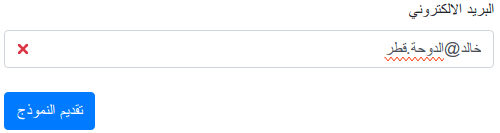
For a better user experience, the widget also shows error squiggles upon completing an email verification, to call attention to a typo or other kinds of error:
Error squiggles can be turned off by way of the squiggles setting mentioned below.
Directionality
The widget automatically recognizes the directionality of each input element it binds to and adapts its visual feedback accordingly: its default CSS classes display a visual indicator about the validity of the email address at either the right or the left side, in the event the input element has a computed dir value of either ltr (for language written from left to right (ltr), like Latin, Cyrillic, (Modern) Greek, Indic and Southeast Asian scripts) or rtl (for languages written from right to left (rtl) - like Arabic, Hebrew, Persian, Urdu and Sindhi). Error squiggles are also shown according to that directionality.
Since the widget reacts according to the the computed dir value, it automatically obeys to closest dir value set for any of its ancestors: the most common scenario is the one where the dir value is applied only once at the root html element, as shown in the example below:
<html dir="rtl">
    ...
    <div>
        ...
        <input type="email" ...>
It is also possible to instruct the Verifalia widget to handle directionality for content whose direction is not known in advance, like in the event an input field must accept both left to right and right to left email addresses. For this, it is necessary to explicitly specify a dir attribute at the input field level, with a value of auto, as shown in the example below:
<html>
    ...
    <div>
        ...
        <input type="email" dir="auto" ...>
In that case, the widget automatically adapts the directionality of its visual feedback based on the actual content of the input field, as it is filled by the user:
For further advanced customization, the widget also adds an attribute named verifalia-field-dir to the attached input element with a value which reflects the computed directionality (which can be any of ltr or rtl) of that element, so that it is possible to customize the CSS rules for its visual feedback according to that value.
Here is, for example, how one may redefine the verifalia-field-invalid CSS class for right to left languages:
.verifalia-field-invalid[verifalia-field-dir=rtl] {
    background-color: #f00;
}
Integration with existing validation libraries and form building services
While this widget does not have any dependency on any external validation library, it automatically detects the presence of the most widely used ones and seamlessly provides its email verification logic to them; the same holds true for several form building providers. We currently provide out-of-the-box support for: FormSite, FormStack, FormValidation, jQuery Validation Plugin, Parsley, Validate.js.
FormSite
This widget works with the FormSite platform: whenever it detects it is running on a page hosted by FormSite, it automatically provides the Verifalia email validation logic to the form. To add the Verifalia widget to a FormSite form, just place the code snippet you can retrieve from the Verifalia dashboard into a Custom Code item, which can be found in the Formatting Items tab in the FormSite's Form Editor.
FormStack
The widget also works with the FormStack service: whenever it detects it is running on a page hosted by FormStack, it automatically provides the Verifalia email validation logic to the form. To add the Verifalia widget to a FormStack form, just paste the code snippet you can copy from the Verifalia dashboard into the Footer HTML editor , which can be found in the Advanced Code Editor in the FormStack's editor.
jQuery Validation Plugin
The widget supports jQuery Validation Plugin out of the box. If it detects jQuery Validation Plugin is loaded on the page, it automatically overrides the default email validation logic. Also no additional binding is done for input fields, in order to comply with the existing jQuery Validation Plugin configuration.
Under this mode, the widget does not add any CSS class to the fields, in order to play nicely with the existing jQuery Validation Plugin visual feedback.
Parsley
The Verifalia widget supports the Parsley form validation library out of the box. If it detects Parsley is loaded on the page, it automatically participates to the Parsley validation process and binds to input fields according to the HTML5 forms scaffolding logic mentioned above.
Under this mode, the widget does not add any CSS class to the fields, in order to play nicely with the existing Parsley visual feedback.
Validate.js
This widget supports the Validate.js library out of the box. If it detects Validate.js is loaded on the page, it automatically overrides the default email validation logic. Also no additional binding is done for input fields and no additional CSS classes are added to them, in order to play nicely with any existing Validate.js configuration.
FormValidation
Support for the FormValidation library is provided out of the box as well. If the widget detects that library is loaded on the page, it automatically replaces the default FormValidation.validators.emailAddress validation logic. In this case, no additional binding is done for input fields, in order to comply with the existing library behavior.
Configuring the widget
The Verifalia widget comes with a default configuration which should suit the most common needs. For advances usage scenarios, it is possible to customize the behavior of the widget using either Javascript or through certain HTML attributes applied to the document markup. For a complete list of the settings available to this widget, please see the Advanced settings section below.
Using Javascript
This method requires you to add a small configuration script before the inclusion of the verifalia-widget.js mentioned above, where you add a new property named VerifaliaWidgetConfig to the window object. This property will be read by the widget at its loading and allows to adjust its settings; modifying the VerifaliaWidgetConfig object after the widget is loaded won't have any effect.
Here is how to set, for example, your browser app key through the VerifaliaWidgetConfig global object:
<script>
    window.VerifaliaWidgetConfig = {
        appKey: 'YOUR-APPKEY-HERE'
    };
</script>
Using data-verifalia-* attributes
Alternatively, you can configure your widget by way of certain attributes whose names begin with data-verifalia-, which you can apply to the specific input field you wish the widget to bind to or to any of its ascendant elements, including the parent form and the document body. As a final fall-back element, the widget also looks for any data-verifalia-* attribute in the script element which loaded it.
Here is, for example, how to set your browser app key at the body level:
<body data-verifalia-appkey="YOUR-APPKEY-HERE">
    ...
Advanced settings
This section contains reference for the configuration settings available to the Verifalia widget.
inputBindings
You can configure how the widget binds to the input fields through the inputBindings property. Here is the object structure and a type definition of the available properties, with each item being optional and coming with a default value as mentioned in the next sections:
inputBindings: {
    appendHiddenFields: boolean,
    autoWireup: boolean,
    classNames: {
        base: string,
        exception: string,
        invalid: string,
        valid: string,
        throttled: string,
        processing: string
    },
    debounceTime: number,
    events: string,
    preventSubmission: string,
    squiggles: boolean
}
See below for details about each setting.
inputBindings.appendHiddenFields
If true appends the hidden input fields to the form upon completing an email validation, with the validation outcome. Defaults to true.
As an alternative to the configuration script, it is also possible to adjust this setting by way of the data-verifalia-inputBindings-appendHiddenFields
attribute (see Using data-verifalia-* attributes).
inputBindings.autoWireup
If true enables the automatic binding of input fields as described above. Defaults to true.
As an alternative to the configuration script, it is also possible to adjust this setting by way of the data-verifalia-inputBindings-autoWireup
attribute (see Using data-verifalia-* attributes).
inputBindings.classNames
The CSS class names to add to the fields, according to the logic explained above:
basecontains the CSS class name to apply to each field the Verifalia widget attaches to, defaults toverifalia-field;processingcontains the CSS class name to apply while the email validation is in progress, defaults toverifalia-field-processing;validcontains the CSS class name to apply for fields containing a valid email address, defaults toverifalia-field-valid;invalidcontains the CSS class name to apply for fields containing an invalid email address, defaults toverifalia-field-invalid;throttledcontains the CSS class name to apply if the email validation request has been throttled, defaults toverifalia-field-throttled;exceptioncontains the CSS class name to apply in the event of a network or code error, defaults toverifalia-field-exception.
As an alternative to the configuration script, it is also possible to set the CSS class names by way of the data-verifalia-inputBindings-classNames-base,
data-verifalia-inputBindings-classNames-processing, data-verifalia-inputBindings-classNames-valid, data-verifalia-inputBindings-classNames-invalid, data-verifalia-inputBindings-classNames-throttled and data-verifalia-inputBindings-classNames-exception attributes, respectively. See Using data-verifalia-* attributes.
inputBindings.debounceTime
The time we allow between keystrokes before attempting to verify the input value for the field, expressed in milliseconds. Defaults to 500.
As an alternative to the configuration script, it is also possible to adjust this setting by way of the data-verifalia-inputBindings-debounceTime
attribute (see Using data-verifalia-* attributes).
inputBindings.events
Zero or more input field events the widget binds to and triggers the email verification for, separated by a comma (,). Defaults to input, meaning
the widget will start verifying email addresses on any change made in the input field text content. When no events are set (such as when the configured
value is an empty string), the widget starts verifying email addresses only upon submitting the parent form.
As an alternative to the configuration script, it is also possible to adjust this setting by way of the data-verifalia-inputBindings-events
attribute (see Using data-verifalia-* attributes).
inputBindings.preventSubmission
A string with the condition(s) which must prevent a form to be submitted, separated by a comma (,); the allowed conditions are:
invalid, which means a field containing an invalid email address should not allow the parent form to be submitted;throttled, meaning an email validation request which exceeds the maximum limit (as configured in the Verifalia clients area) should prevent the form submission;exception, which causes email validation requests resulting in an error (such as a network error because of no connectivity to the Internet, for example) to prevent the form submission.
Defaults to invalid, throttled.
As an alternative to the configuration script, it is also possible to adjust this setting by way of the data-verifalia-inputBindings-preventSubmission
attribute (see Using data-verifalia-* attributes).
inputBindings.squiggles
If true displays squiggles within the input field upon completing an email validation, in the event the widget detects typos or in other cases where an additional error indicator could make sense for the user. Defaults to true.
As an alternative to the configuration script, it is also possible to adjust this setting by way of the data-verifalia-inputBindings-squiggles
attribute (see Using data-verifalia-* attributes).
emailValidations
Defines the email validation logic and preferences for the Verifalia widget. Here is the object structure and a type definition of the available properties, with each item being optional and coming with a default value as mentioned in the next sections:
emailValidations: {
    allow: string,
    block: string,
    memoize: boolean | number,
    messages: {
        invalid: string,
        processing: string,
        throttled: string
    }
};
The widget only allows the email addresses which pass the allow rule and do not pass the block rule.
emailValidations.allow
A string with one or more classifications, status codes or attributes (free and role) the widget will allow to pass the form validation, separated by a comma (,). Classifications must appear using their names, status codes must use the prefix status: plus the actual status code value and attributes must use the @ prefix and either the free, role or disposable values. All the string is processed in a case-insensitive way.
Here is, for example, how to define the allow rule for a widget which allows Deliverable and Unknown classification as well as role accounts and catch-all mailboxes:
allow: 'deliverable, unknown, @role, status:ServerIsCatchAll'
The allow rule has a default value of deliverable, risky, unknown.
As an alternative to the configuration script, it is also possible to adjust this setting by way of the data-verifalia-emailValidations-allow
attribute (see Using data-verifalia-* attributes).
emailValidations.block
A string with the same format of the allow rule mentioned above.
Here is, for example, how to define the block rule for a widget which does not allow free email addresses (like those provided by Gmail and Yahoo):
block: '@free'
The block rule has a default value of @disposable.
As an alternative to the configuration script, it is also possible to adjust this setting by way of the data-verifalia-emailValidations-block
attribute (see Using data-verifalia-* attributes).
emailValidations.memoize
A value which allows to configure the memoization of email validation results, improving the widget response time in certain cases. If true, the widget automatically memoize email validation results for 60 seconds, when possible. If false, the widget does not memoize any validation result. It is also possible to pass a number to memoize: in this case, the value is considered as the number of memoization seconds the widget must apply. Defaults to true.
As an alternative to the configuration script, it is also possible to adjust this setting by way of the data-verifalia-emailValidations-memoize
attribute (see Using data-verifalia-* attributes).
emailValidations.messages
The texts for the messages the widget uses to provide feedback to the underlying form validation system:
invaliddefaults toPlease enter a valid email address.;processingdefaults toPlease hold on for a second, until we verify this email address...;throttleddefaults toToo many attempts, please try again later.;
As an alternative to the configuration script, it is also possible to set each message text by way of the data-verifalia-emailValidations-messages-invalid,
data-verifalia-emailValidations-messages-processing and data-verifalia-emailValidations-messages-throttled attributes, respectively. See Using data-verifalia-* attributes.
Widget methods
Once installed, the widget adds a VerifaliaWidget object to the window global object, which can be used to perform certain advanced operations whenever a customized behavior is needed.
wireup() method
The wireup() method allows to manually attach the widget to a certain portion of the DOM and can be used whenever autoWireup has been manually set to false. The method is defined as (TypeScript syntax):
wireup(rootNode: Node, live: boolean): void
where:
rootNodeis the DOM node which the widget will scaffold in order to bind to child (or even self)inputfields;liveis a boolean value that, if set, will make the widget constantly monitor the DOM for new additions.
For example, the default autoWireup value of true will have the same outcome of running the following block of code, once the widget has been loaded:
window.VerifaliaWidget.wireup(document, true);
Widget events
During its lifecycle, the widget triggers some synthetic events which allow listeners to be notified of notable activities and eventually react accordingly; all these events are named with the verifalia-widget: prefix, to ease their handling.
verifalia-widget:initializing event
The verifalia-widget:initializing event is fired exactly one time, upon initializing the widget script, from the document object. It is cancelable, allowing
listeners to abort the widget initialization by way of the preventDefault() method if desired.
<script>
    document.addEventListener('verifalia-widget:initializing', function (event) {
        console.log('The Verifalia widget is initializing, drum roll...');

        // Uncomment the line below to abort the widget initialization
        // event.preventDefault();
    });
</script>
verifalia-widget:initialized event
The verifalia-widget:initialized event is fired exactly one time, as soon as the widget finishes initializing: the event is triggered from the document object and bubbles up.
<script>
    document.addEventListener('verifalia-widget:initialized', function (event) {
        console.log('The Verifalia widget is initialized: enjoy!');
    });
</script>
verifalia-widget:field-validation-started
The verifalia-widget:field-validation-started event is fired whenever the widget starts verifying an input field; it is triggered from the target field's element object and bubbles up the DOM hierarchy.
<script>
    document.addEventListener('verifalia-widget:field-validation-started', function (event) {
        console.log('Email verification started for field', event.target);
    });
</script>
verifalia-widget:field-validation-completed
The verifalia-widget:field-validation-completed event is fired whenever the verification process for an input field ends; it is triggered from the target field's element object and bubbles up the DOM hierarchy. Its detail field contains important details about the verification process, which include a status
field with the overall process status and an optional validation object with the actual email validation data, where available.
The status field contains one of the following values:
Allowedwhenever the email verification passes the allow/block settings (default to allowing Deliverable, Risky and Unknown emails and blocking disposable mails);NotAllowed- the opposite of the value above - means the email verification does not pass the allow/block settings;Throttledif the request exceeded the maximum limit, as configured in the Verifalia clients area;Exceptionin the event of an unhandled exception;Canceledwhenever the verification is canceled (for example, if the field value is changed in the middle of an existing email verification).
The validation field is present only when the status field is Allowed or NotAllowed and contains an object with the full job snapshot structure returned by the Verifalia API, which includes every possible result detail about the email verification.
<script>
    document.addEventListener('verifalia-widget:field-validation-completed', function (event) {
        console.log('Email verification completed for field', event.target);
        console.log('Status', event.detail.status);
        console.log('Validation', event.detail.validation);
    });
</script>
Known limitations
No scripts can run on sites hosted at Google Sites, including the Verifalia widget: even if their web page wizard allows to embed custom html, they place every embedded code block in a distinct sandboxed iframe, which can't access other sections of the page for security reasons. Thus if one embeds the widget, it won't be able to access the email fields in a form defined in another iframe.
Changelog / What's new
v1.7
Released on March 26th, 2021
- Added support for live binding of input fields (that is, the widget will attach itself to
inputfields created even after the containing page has been loaded and not just to the ones that exist at the loading time), which is now the default behavior for the autoWireup settings. - Added the
wireup()method, which allows to manually attach the widget to a specific set ofinputfields. - Added support for the FormValidation form validation library.
- Added support for the FormSite form building service.
- Added support for the FormStack form building service.
v1.6
Released on November 12th, 2020
- Added support for the Validate.js validation library.
- Added the ability to configure the widget through
data-verifalia-*attributes specified in the importingscriptelement. - Added configurable support for results memoization (a technique which allows to get validation results faster, in certain cases).
- Aligned the Verifalia widget to the Verifalia API v2.2.
- Improved the overall widget performance: the script now weights only 9KB (gzipped).
- Fixed a compatibility bug with the jQuery Validation plugin.
- Fixed a memory leak in the internal events manager.
v1.5
Released on May 21st, 2020
- Added support for right to left (rtl) directionality, allowing the widget to play nicely within HTML documents which use languages written from right to left (like Arabic, Hebrew, Persian, Urdu, Sindhi and others).
- Improved README.
v1.4.3
Released on May 7th, 2020
- Added support for squiggles.
- Fixed an issue which caused the widget to automatically focus on an invalid field on blur.
- Improved README.
v1.3.1
Released on April 11th, 2020
- Improved README with additional documentation.
v1.3
Released on April 9th, 2020
- Added support for widget events.
v1.2
Released on February 27th, 2020
- Aligned the Verifalia widget to the Verifalia API v2.1.
- Updated README with more exaustive documentation.
v1.1
Released on October 3rd, 2019
- Added support for IE11 and Edge.
- Added support for ES5.
- Added a console message in the event the widget configuration contains errors.
v1.0.1
Released on September 27th, 2019
- Fixed the default export of the script, for improved compatibility.
- Updated README with turn-key snippets for including the Verifalia widget from a CDN.
v1.0
Released on September 26th, 2019
- First public release of the Verifalia widget, aligned to the Verifalia API v2.0.