README
world-daylight-map
What's This?
A library enabling you to embed a map of the world with a daylight/night-time overlay.
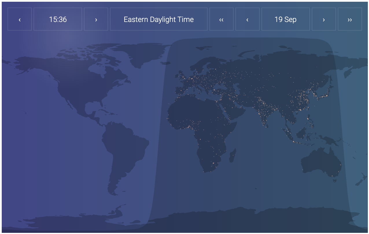
see demo here.
Basic Usage
At the moment, this library only works as a react import. I plan to add a UMD build in the near future.
To use it in your react app:
- Add the package to your react app:
npm i -S world-daylight-map
- Import and use it in a typescript/es6 project as follows:
import * as React from 'react';
import * as ReactDOM from 'react-dom';
import { WorldDaylightMap } from 'world-daylight-map';

const App = () => {
  return (
    <div style={{ width: '100%', height: '400px' }}>
      <WorldDaylightMap />
    </div>
  );
};

ReactDOM.render(<App />, document.getElementById('root'));
In an es5 project, replace the library import with const WorldDaylightMap = require('world-daylight-map').default;. The package has typescript types built in.
Configuration
The WorldDaylightMap constructor takes an optional options object as prop with the default values indicated here:
<WorldDaylightMap
  options={{
    width: '100%',
    height: '100%',
    controlsPosition: 'outer-top',
    controlsScale: 1.0,
    font: "'Roboto', sans-serif",
    fontSize: undefined,
    isSunshineDisplayed: true,
    icons: [
      // Example:
      // {
      //   iconLabel: 'London',
      //   iconUrl: 'icon-computer.png',
      //   iconCoord: { lat: 51.507222, lng: -0.1275 },
      //   iconLink: 'https://en.wikipedia.org/wiki/London',
      //   iconToSvgWidthRatio: 1 / 20,
      //   iconWidth: 100, // Overrides iconToSvgWidthRatio
      //   iconHeight: 200, // Overrides iconToSvgWidthRatio
      // },
    ],
  }}
/>
Notes on options:
- width/height
- These are '100%' by default, so the WorldDaylightMap constructor can simply be placed into a parent with non-zero width/height without any further configuration. You can override these default values with a number or string (as per standard css-in-js standards; under the hood world-daylight-map uses MaterialUI CSS-in-JS styles.
- controlsPosition
- Determines if/where you place the date/time controls; it takes the following values:
- 'outer-top'
- 'top'
- 'top-left'
- 'top-right'
- 'bottom'
- 'bottom-left'
- 'bottom-right'
- 'no-controls'
- Determines if/where you place the date/time controls; it takes the following values:
- controlsScale
- Takes a value between 0 and 1, scales the size of the controls box
- font
- Standard CSS string; you need to make the font available within your CSS setup
- Note: this library uses Roboto as default; if you do not have Roboto available in your CSS setup then it will default to whatever the active font is for your parent container
- fontSize
- By default, this property has value 'undefined', which causes the library to automatically scale your text based upon the width of the container. You can override this scaling-font size by an absolute value (number of string)
- isSunshineDisplayed
- Boolean that controls whether or not to display a radial gradient to mimic the sunshine on the earth's surface
- icons
- This is an array of objects that let you add icons at runtime that get displayed on the map; useful if you want to illustrate e.g. office locations for you organization
- Note: icon sizing is rendered in svg coords, which means that the icon will get stretched unless your container has a ratio of 2:1. You can manually adjust the icon's size to compensate for this fact
- The properties of the icon object are:
- iconLabel
- Text that will get display as a tooltip over your icon
- iconUrl
- Url to image to be displayed
- iconCoord
- Object of form
{lat: decimalLongitude, lng: decimalLatitude}giving coordinates that the icon will be centered over
- Object of form
- iconLink
- Optional url to be directed to if user clicks on icon
- iconToSvgWidthRatio
- Controls width of displayed icon; this is the ratio of icon width to container width; equal to 1/20 by default
- iconWidth
- Optional. If provided, it will override iconToSvgWidthRatio. iconWidth has to be a number that directly sets the width in pixels. It will also determine the icon's height if iconHeight is not provided
- iconHeight
- Optional. If provided, it will override iconToSvgWidthRatio. iconHeight has to be a number that directly sets the height in pixels. It will also determine the icon's width if iconWidth is not provided
- iconLabel
Acknowledgements
This library is adapted from Paul J. Noble's repo. I thank him for his research and elegant approach to this problem, as well as the authors of the libraries and data sources that he mentions that are used in these two repos:
TODOs
- Enable UMD build
- Enable d3 externalization